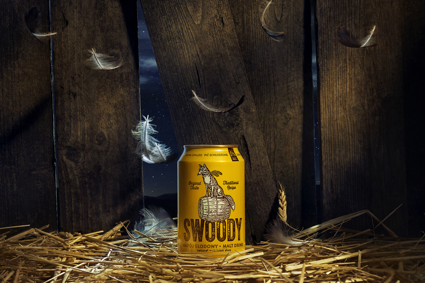
Our task was to create a new brand (naming and packaging) on the market of malt, non-alcoholic beverages for Perła Browary Lubelskie.
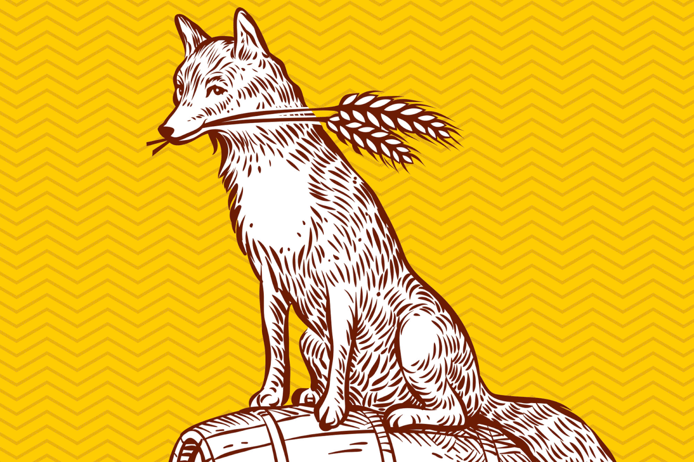
The Swoody hero is a fox – clever animal, captured just before rummaging in the cereal field, now he is sitting on a barrel in a triumphant pose, with ears like trophies, held in the mouth. The word swoody ideally calls the product contained in the package. It is simple, easy to remember and intuitive in pronunciation. In polish "malt" translates into "słód" which made us to play with the sound of it. The packaging is kept in malty colors. Yellows and browns give it an appetizing character.
It is impossible to pass indifferently by fox Swoody playing innocent, who, although he has a lot of bosom, knows what is good and chooses only the best bites ... and drinks. Our Swoody proudly made himself up on the 114th page of Archive 200 Best Packaging Design 2015/16 among the best from around the world. A copy as a corpus delicti for inspection in our office. In 2015, we received the KTR silver sword in the Design category for Swoody's design.